Colors
Colors are an important part of Storia’s Visual Identity System. Not only do they awake emotions, but also convey information. Storia’s color system has a developed color scheme. Introducing additional colors should be accompanied by establishing their purpose.
Choose right color system
Color specifications vary with the media used, so it is important to use the correct mode for your specific application to achieve your intended values. All colors were described according to the most important color systems.

RGB
digital usage

HEX
digital usage

CMYK
print usage

PANTONE®
print usage
Main color palette
The color palette uses a tangerine - aqua blue color code. The main color pair is Tangerine and Aqua Blue, while Grey is a functional color.
Tangerine
RGB 242 / 102 / 78
CMYK 00/75/72/00
HEX #f1654d
Pantone® 7416
Browned Tangerine
RGB 207 / 70 / 57
CMYK 5/85/80/10
HEX #cf4639
Pantone® 180
35%
Opacity
Tangerine
Aqua Blue
RGB 62 / 193 / 207
CMYK 60 / 0 / 20 / 00
HEX #3ec1cf
Pantone® 319
Blue
RGB 34 / 164 / 183
CMYK 75 / 15 / 25 / 0
HEX #22a4b7
Pantone® 7459
45%
Opacity
Aqua Blue on white
Grey
RGB 63 / 62 / 62
CMYK 00 / 00 / 00 / 90
HEX #3e3e3d
Light Grey
RGB 91 / 92 / 102
CMYK 75 / 65 / 55 / 05
HEX #5a5b65
10%
Opacity
Grey on white
Last update: 2022-01-26
Additional color palette
The additional colors palette has an exchangeable and supplementing character. The use of these colors should always be well thought out and has a specific functionality. The color palette uses a tangerine - aqua blue color code. The main color pair is Tangerine and Aqua Blue, while Grey is a functional color.
Dark Tangerine
RGB 155 / 53 / 43
CMYK 26 / 89 / 88 / 21
HEX #9b352b
Alt Tangerine
RGB 242 / 102 / 78
CMYK 00 / 60 / 50 / 00
HEX #f48473
25%
Opacity
Alt Tangerine
Dark Blue
RGB 30 / 129 / 145
CMYK 83 / 35 / 37 / 05
HEX #3ec1cf
Alt Blue
RGB 120 / 205 / 209
CMYK 50 / 0 / 20 / 00
HEX #78cdd1
25%
Opacity
Alt Blue
Last update: 2022-01-26
Additional color palette
The additional colors palette has an exchangeable and supplementing character. The use of these colors should always be well thought out and has a specific functionality. The color palette uses a tangerine - aqua blue color code. The main color pair is Tangerine and Aqua Blue, while Grey is a functional color.

Typography
Typography is a crucial element of the Visual Identity of the brand. Storia’s visual identity uses a simple, but characteristic and modern sans serif font - Sora.
Aa Bb
Main font: Sora
The font was designed in a way to capture the essence of the digital world, a font family which works well on low resolutions and early on-screen typography. Sora is a great tool for apps and websites, where clarity and e ectiveness are important.
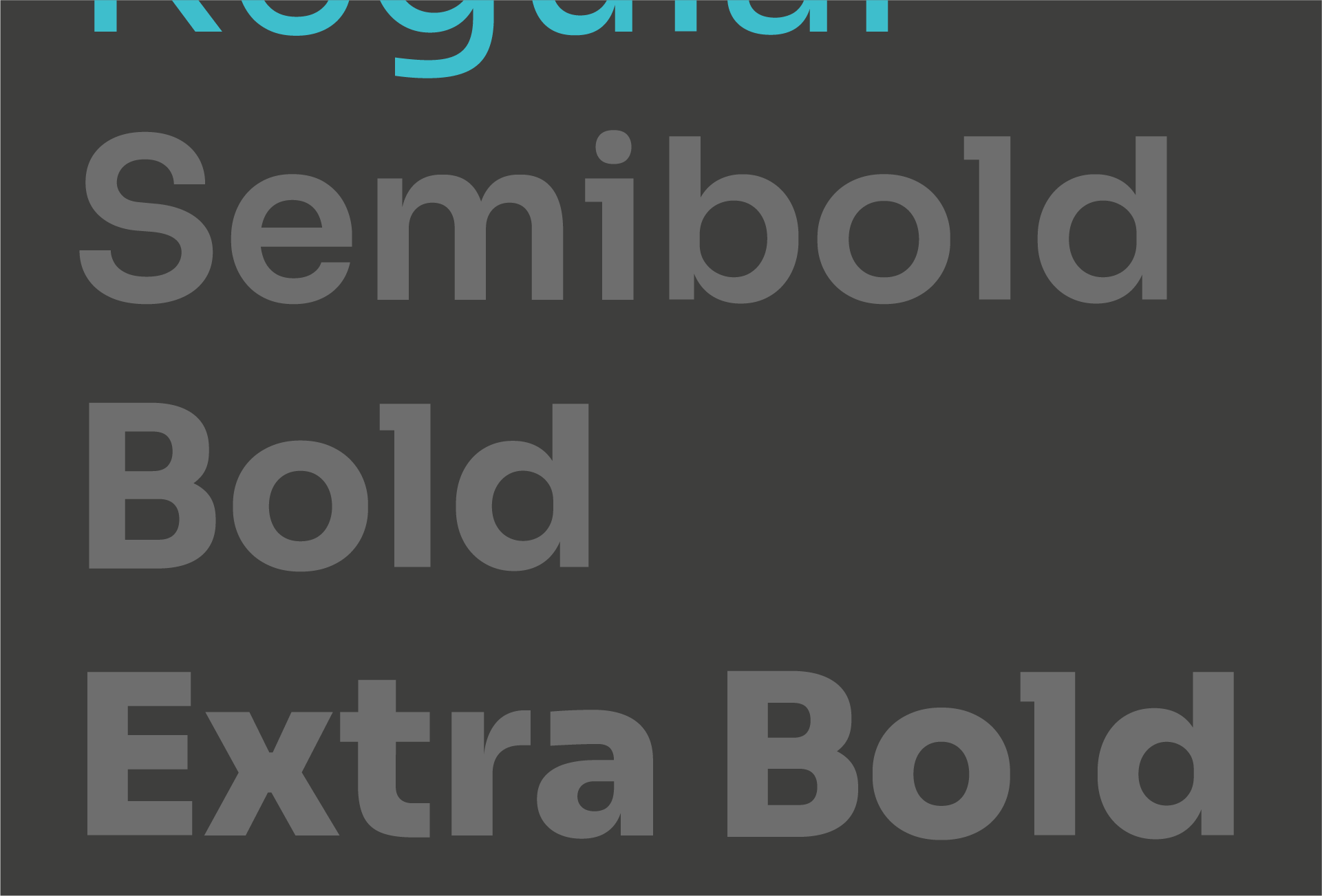
The brand identity uses the Regular variant mostly for paragraph and small scale text and Semibold variant which works perfectly in headlines.
Sora Thin
Sora Regular
Sora Semi-bold
Sora Bold
Sora Extra-bold
Last update: 2022-01-26
Typographic styles
Here you can see the recommended font sizes which can be used in the digital space. It can also serve as a base to establish font sizes in print. Prints need to always be checked in terms of readability and the sizes described here are only a recommendations. Choosing the right font sizes depends on readability and information hierarchy.
H1 / Sora Regular + Semi-bold / Size: 72 pt / Line height: 87 pt
dolor sit amet.
H2 / Sora Regular + Semi-bold / Size: 48 pt / Line height: 56 pt
dolor sit amet.
H3 / Sora Regular + Semi-bold / Size: 36 pt / Line height: 44 pt
dolor sit amet.
T1 / Sora Regular + Semi-bold / Size: 24 pt / Line height: 28 pt
commodo libero et,
elementum massa.
T2 / Sora Semi-bold / Size: 16 pt / Line height: 26 pt
- Aliquam non ante sed felis dictum.
- Vestibulum mollis nisi ut dui egestas.
- Sed fringilla ligula eu risus lacinia.
T3 / Sora Semi-bold / Size: 14 pt / Line height: 18 pt
Donec tempor neque facilisis suscipit elementum. Vestibulum pharetra rutrum odio, at ullamcorper nisi e citur at. Quisque ac nisi id neque iaculis viverra.
System font: Arial
Whenever a carrier or media has a limited availability of fonts (a Power Point presentation, Microsoft Word document, etc.) it is allowed to use a system font - Arial.
Aa Bb
Arial Regular
Arial Italic
Arial Bold
Arial Bold Italic
Icons
An important elements of Storia’s brand identity is the way in which th emotions and values are being expressed. The icons support the visual representation.
Icons set the direction in which the brand message is being developed though a symbolic and direct reference to key phrases and headlines.
Last update: 2022-01-26
Icon style
New icon style is flexible and easy to use. The precedent rule is building the icons out of rounded shapes. These icons can be pictograms, with the meaning shown directly (e.g. category icons) or they can be more symbolic (e.g. the icon of a tree can inform about green spaces or symbolize a lot). They can also convey emotions through abstraction (e.g. heart, star). This icon style should be coherent throughout the set. The rules are set in a flexible way to have an option of creating new icons in the future open.
Category icons
Category icons are more specific, because they convey a more specific information directed at the users of the Storia on-line service and other entities. The icons are designed in a way, where they clearly define a category.
Last update: 2022-01-26
Backgrounds
Icons and shapes have a direct use in building backgrounds which are commonly used throughout th Visual Identity.
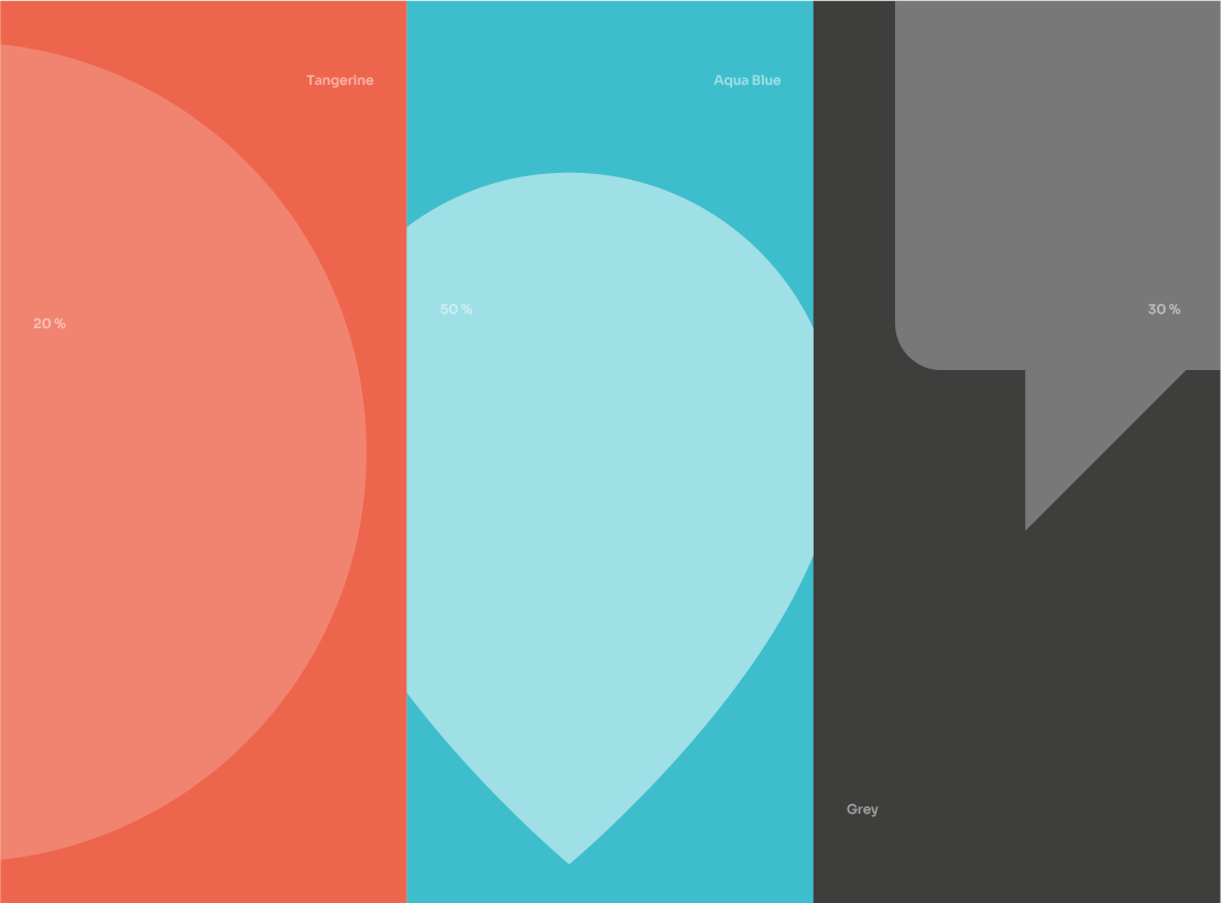
The backgrounds use full color with a cropped shape or icon in white shades (15-30% opacity).

Last update: 2022-01-26
Types
A background expresses visual characteristics of the brand and is an inherent brand design tool. Storia's Visual Identity offers a set of backgrounds, which originated in the symbol.
These backgrounds are made with two shapes: a rectangle that sets the background space and a circle cropped into the space. This mechanism can be explored further by adding colors and emotion icons instead of the cropped circle.
The background color should be from the main colours, while the shape should be white with 10-50% opacity, depending on the desired contrast.
Last update: 2022-01-26
Formats
The backgrounds can have different sizes and can be designed freely. When designing, the main component that should be taken into consideration is the copywriting. After all elements are properly composed, you can set the background space in which you will be designing.
Here different formats and color combinations are shown.

Photography
Photos are a huge carrier of information and emotion. That is why it’s important to use photos carefully and in a conscious way. A photo can carry the main message and by being used in the layout it can perfectly express the message and accentuate the brand character.
When looking for photos it is recommended to use keywords described on the next pages.

Real estate
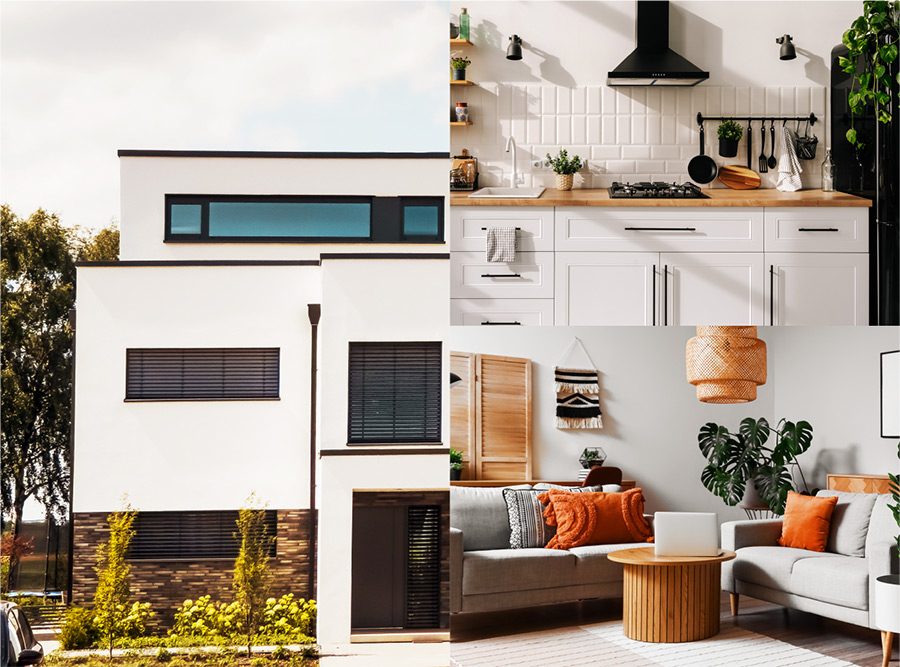
The main theme being explored in Storia’s Visual Identity is real estate. Climatic photos of houses, apartments or apartment buildings should be used throughout the brand design and brand communication. We show interiors, gardens in way that captures the spirit of each place, since it has its own character the same as a person living in it.
Below you will find a set of keywords which can help you find the right photo:
Inhabitants
The second important group are the inhabitants of the real estate and the way they experience their living space. Each home-body has their own character that resonates throughout the apartment, house or even garden. Photos used within the Visual Identity should capture the relationship between a person and their living space originally.
Below you will find a set of keywords which can help you find the right photo:

Illustrations
Storia’s Visual Identity provides for the use of illustrations and even a way to adapt drawings to represent the Storia.
Use of illustrations should be practical, but can also be used decoratively.

Categories
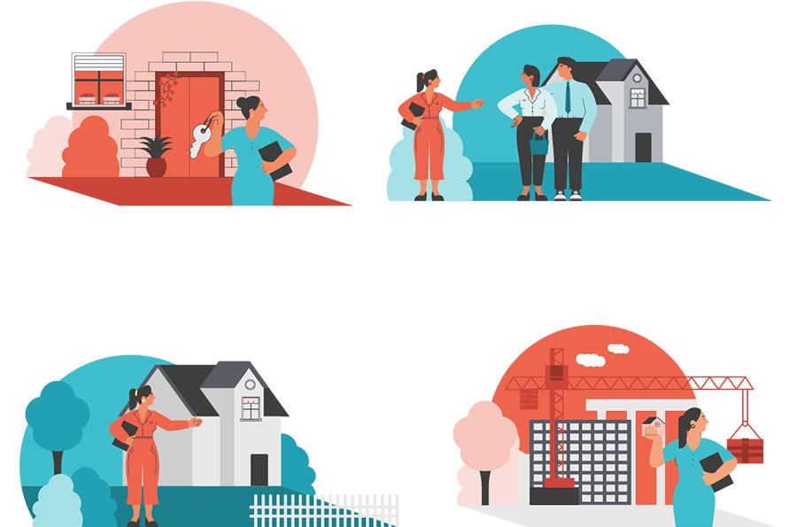
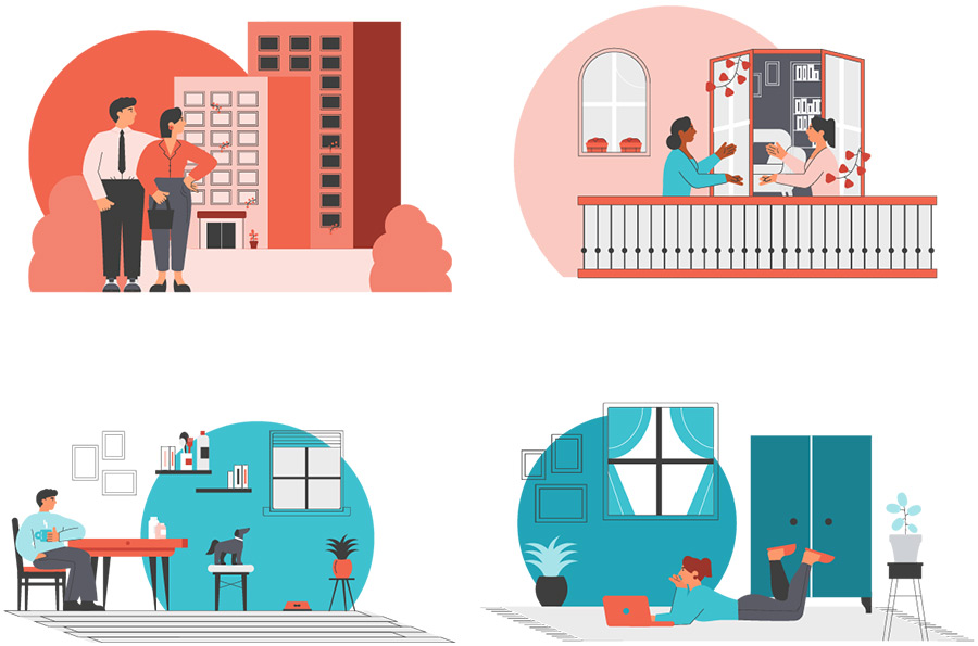
There was several thematic categories selected among the illustrations which are addressed to various target groups. In addiction to standard illustrations that represent an abstract or symbol on particular topic, mainly in Visual Identity there are illustrative scenes.
People looking for new apartment or moving into a new home are the main theme. Illustrations can also show real estate agents or developer in di erent genres.
The natural theme of Storia’s illustrations is architecture. Also depicted in a characteristic way illustration of houses, townhouses or other types of real estate.
Tips
Illustrations presented in the Brandbook are stylistic proposition.
It is acceptable to use other illustrative styles while following a few elementary guidelines to keep the Storia branding consistent.

Last update: 2022-01-26
