The essence of data visualizations
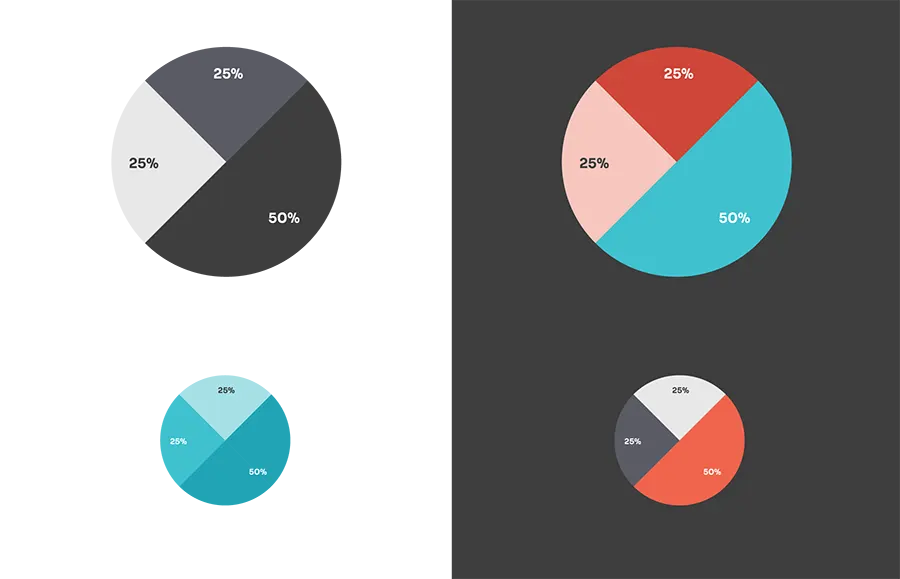
Data is a crucial part of Storia’s communication. Data visualization is a part of the branding, so it’s not only informative, but also strictly branding.
Charts can be used in designs and graphics which cover more than just information. It is therefore important to ensure proper readability and data presentation.
Styles
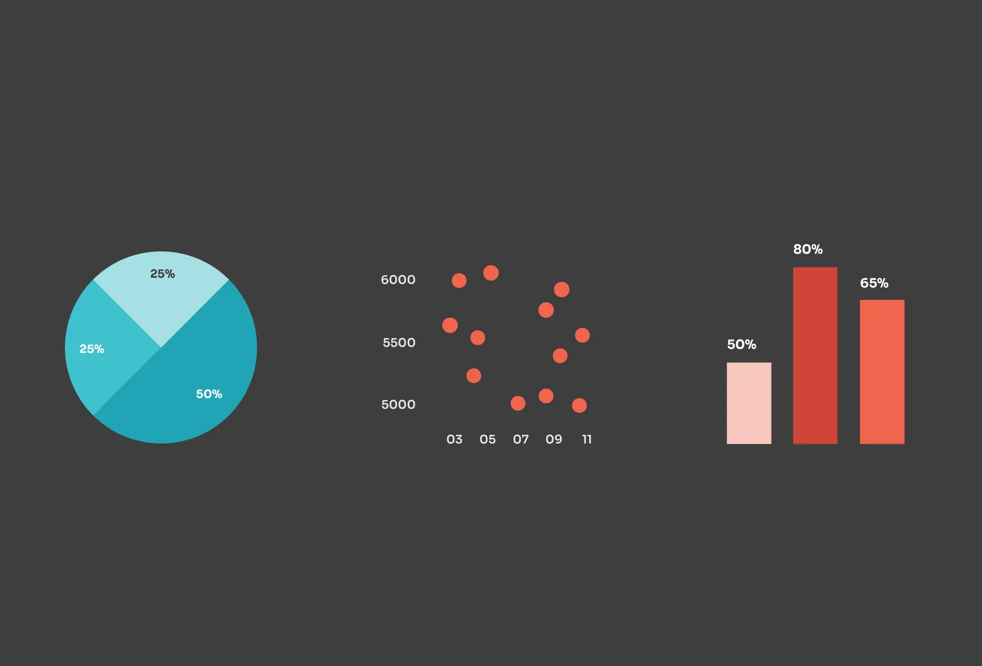
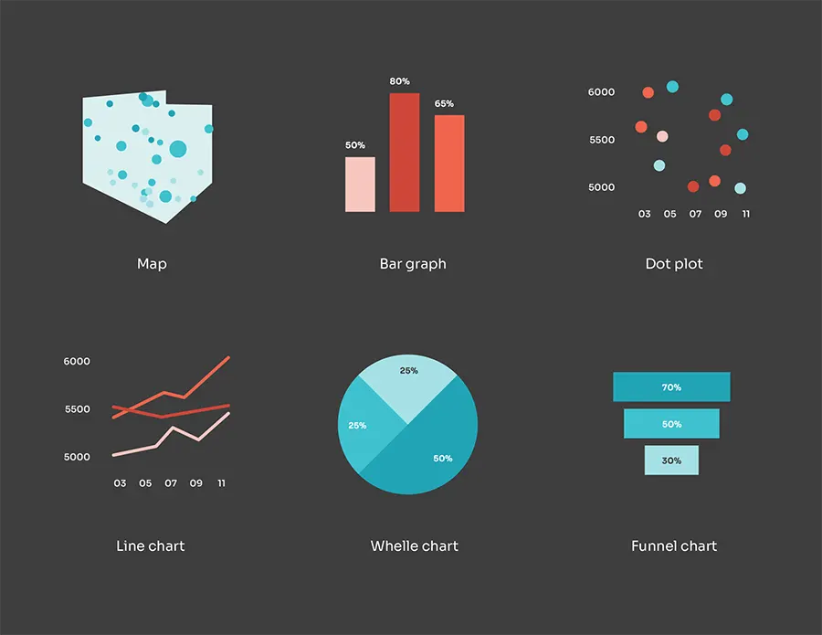
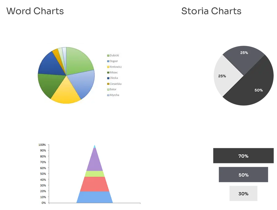
Charts are minimalistic and clean and this is the level of simplicity that should be taken into account when designing diagrams, tables or any other forms of data visualization. It is recommended to use shades of colors, where the most important information is marked with bold colour, while other elements use shed of Grey or light colours.
It is allowed to use different types of charts. Each has a potential to be simplified and carry the characteristic graphic values of the brand.
Adaptation
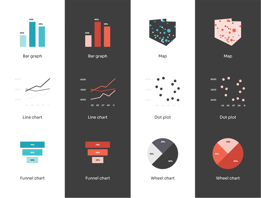
Data should always be presented as charts or diagram, which can be unattractive. To make them more presentable it is recommended to use basic shapes and flat colors. Use main brand colors in different shades, without too many colors in one design to create the right brand value.
Each chart should have a visible description and data source.
Line chart
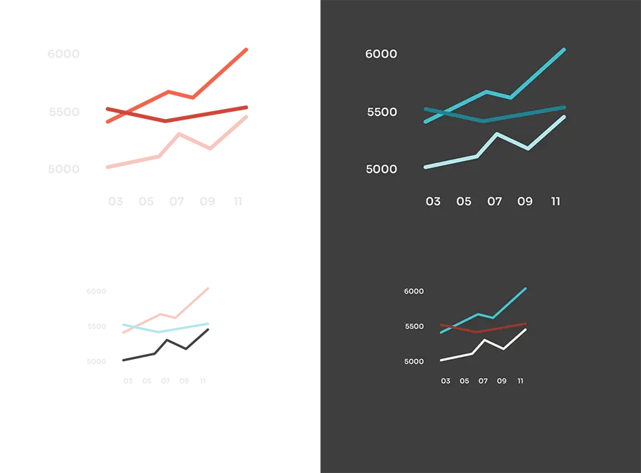
Here you can see the line charts’ examples: on white and Grey with color accents. These graphics are examples and serve as an aesthetic reference. It’s recommended to always take proper data visibility into consideration.
In terms of Line charts deleting the X and Y axes can only be allowed with simple and small diagrams. Each chart should be titled and include the data source.
Last update: 29.02.2024
Bar graph
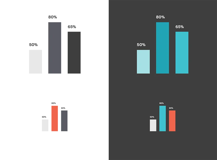
Here you can see the bar graphs’ examples: on white and Grey with color accents. These graphics are examples and serve as an aesthetic reference. It’s recommended to always take proper data visibility into consideration.
Each chart should be titled and include the data source.
Last update: 29.02.2024
Map
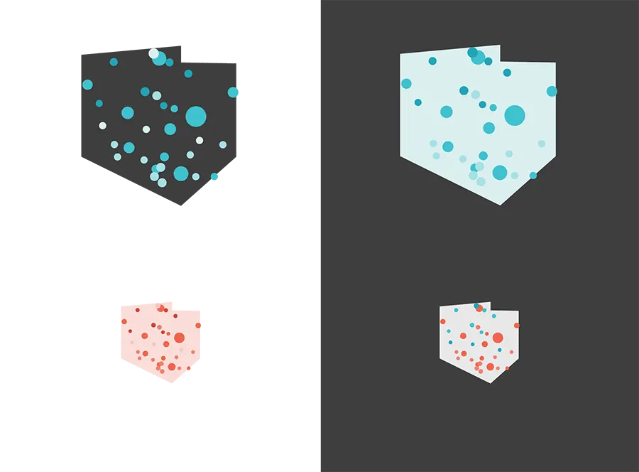
Here you can see the maps’ examples: on white and Grey with color accents. These graphics are examples and serve as an aesthetic reference. It’s recommended to always take proper data visibility into consideration.
Each map should be titled and include the data source.
Last update: 29.02.2024
Funnel chart
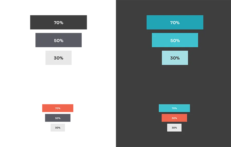
Here you can see the funnel charts’ examples: on white and Grey with color accents. These graphics are examples and serve as an aesthetic reference. It’s recommended to always take proper data visibility into consideration.
Each chart should be titled and include the data source.
Last update: 29.02.2024
Wheel chart
Here you can see the wheel charts examples: on white and Grey with color accents. These graphics are examples and serve as an aesthetic reference. It is recommended to always take
proper data visibility into consideration.
Each chart should be titled and include the data source.
